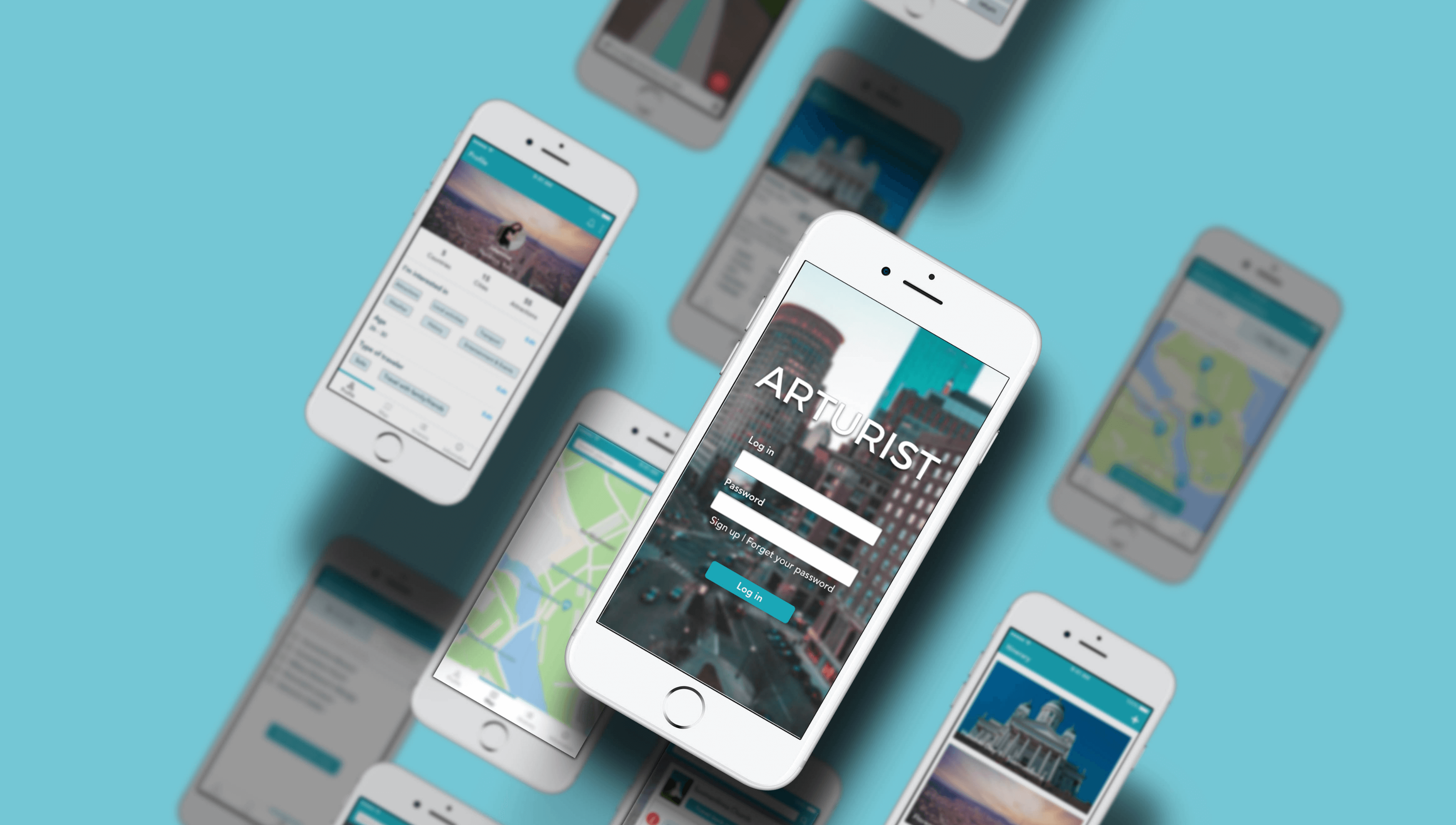
ARTURIST project
Amount of work: 265h
Team: 2 UX designers
Deliverables: High-fidelity clickable prototypes for a mobile travel application (an Android version and an iOs version)
Overview
In the digital age, technology has transformed the way people travel. Thanks to augmented reality or AR, the travelers’ experience has been completely revolutionized. In order to enhance the experience of travelers, we delivered an idea which is based on using AR technology - Arturist application - to unlock the world of digitally augmented content around tourists. Arturist provides people with useful information, navigation and guides about destinations attraction, turning classic city tour into something more remarkable and more enjoyable. With Arturist, people can travel back in time, observing the development of landmarks in time perspective, enjoy 3D models of places, and get pleasure tour guides. Arturist targets to different people with different background who are curious about the knowledge and culture of destinations.
Research
Part 1: Online Survey
A survey was sent to 10 people with different backgrounds to find out what people care about the destinations while traveling.
Key findings:
- Sightseeing & Attraction, Food & Drink and History & Culture are top priorities of people when they arrive to new a destination.
- Almost people would like to share their local experience with others.
Part 2: User Interview
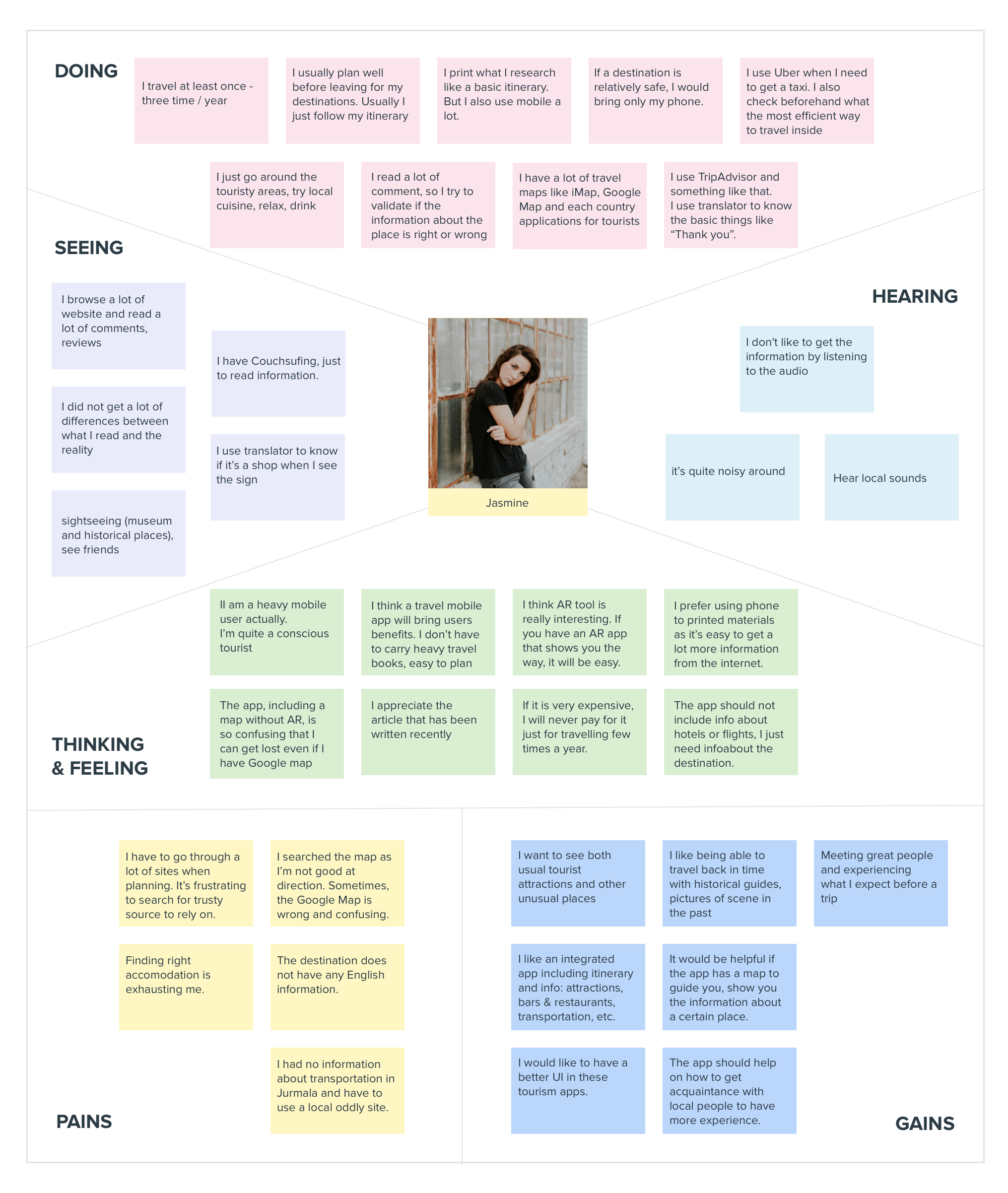
User interview were conducted to gather more information on user's feeling, motivations and how they solve their problems when traveling.
We used Empathy Map as a tool to analyse interview data. An Empathy Map allows us to sum up our learning from engagements with people in the field of design research. The map provides quadrants: thinking & feeling, doing, hearing, seeing, pains and gains which reflect user behaviors. The major areas of the map help us to focus on a person’s experience, being advantage in creating the construction of the personas.
⇒ Top requirements were revealed:
- Show information about history and culture of a certain attraction or sightseeing place
- Direct user from current local to the chosen destination
- Show restaurants, bars, cafes, entertaining places nearby
- Embed the itinerary into the map to find the shortest route
- Show general emergency information in that location
Part 3: User mapping
Firstly, we built a persona based on data which we analyzed. The personas act as substitute for the actual user during the design process which helps us focus more on behaviors rather than demographics.
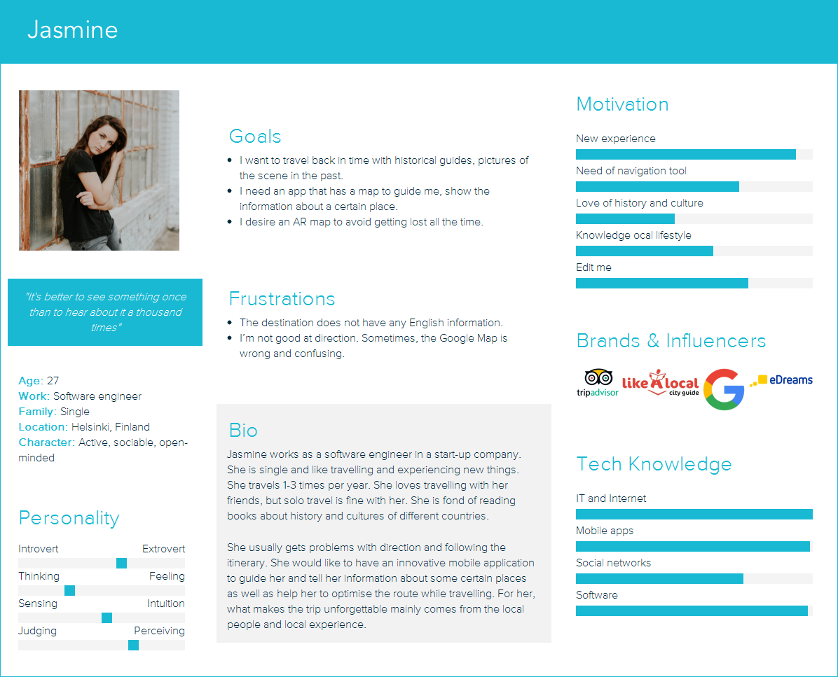
Here’s Jasmine. She is a software engineer. She is single and totally addicted to travel. She loves travelling with her friends (but solo travel is fine with her) to explore history and culture of different countries. Jasmine usually gets problems with direction and following the itinerary. So, how can a new application be of use to her? Look at the story below:
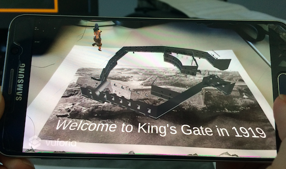
Jasmine is currently in Helsinki, Finland on the winter holiday. She likes historical and cultural attractions, so she tries to visit as many museums and historical buildings as possible. She usually does research and plan her own itinerary. According to her itinerary, she need to visit 4 more places in the afternoon. She is wondering where to go first to optimize the transporting time. She opens a travel map to enter these places on the map to find the shortest route. Then, she uses the navigation feature to follow the route as she is not good at direction. When she arrives the first place, a notification pops up showing “You’ve arrived at King’s Gate, want to get a travel-back-in-time experience ?”. She shows the mobile in front of the cathedral, then gets information and sees the real scenes of that place in 1919. After finishing the route, feeling hungry, she wants to find a place to eat. The travel app shows the nearby restaurants, cafes with their overview information . She finds a sushi restaurant with 5-star rating and gives it a try. After a long travel day, she comes back to hotel, feeling fulfilled with a lot of amazing experience.
From there we identified how user would use the application.
Design
Part 1: Concept Design
After analyzing user data and conducting research on travel applications which are recently available on market, we concluded four key features of Arturist app including:
- Travel-back-in-time experience with AR feature
- Map with location and AR direction
- Important info of destination
- Embedded itinerary into map
We classified functionalities of the app into four main sections:
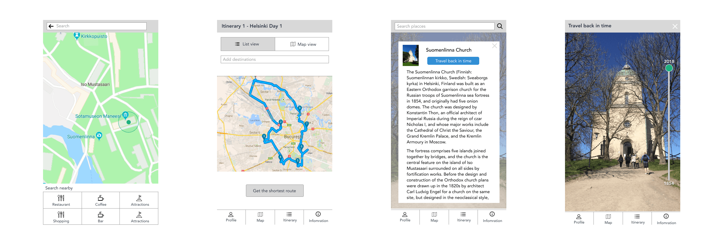
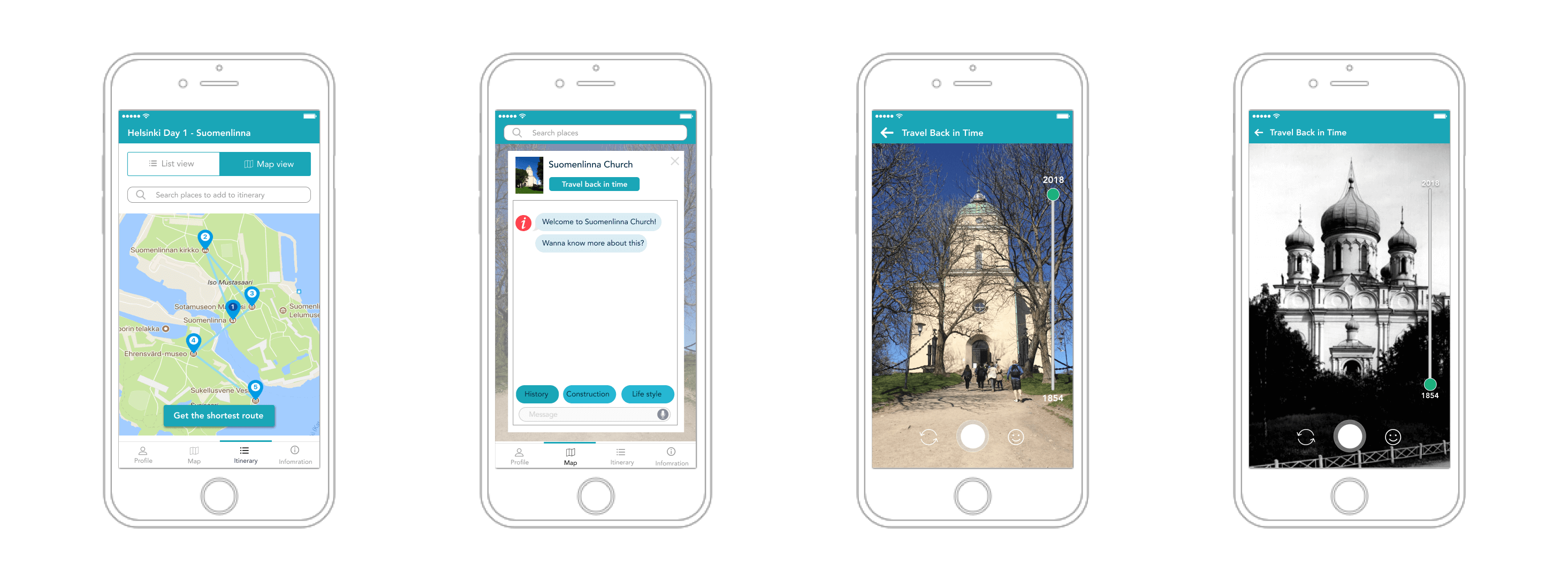
- General Information presents some facts of the country where user is currently located and location weather.
- Map is equipped with plenty of features including searching place, AR navigation, travel-back-in-time, stories of destination and taking picture with traditional filters.
- Itinerary allows users to manage and modify their plan and helps them to find a shortest way to visit all desire destinations.
- Profile collects user data to provide suitable content for user while using the application.
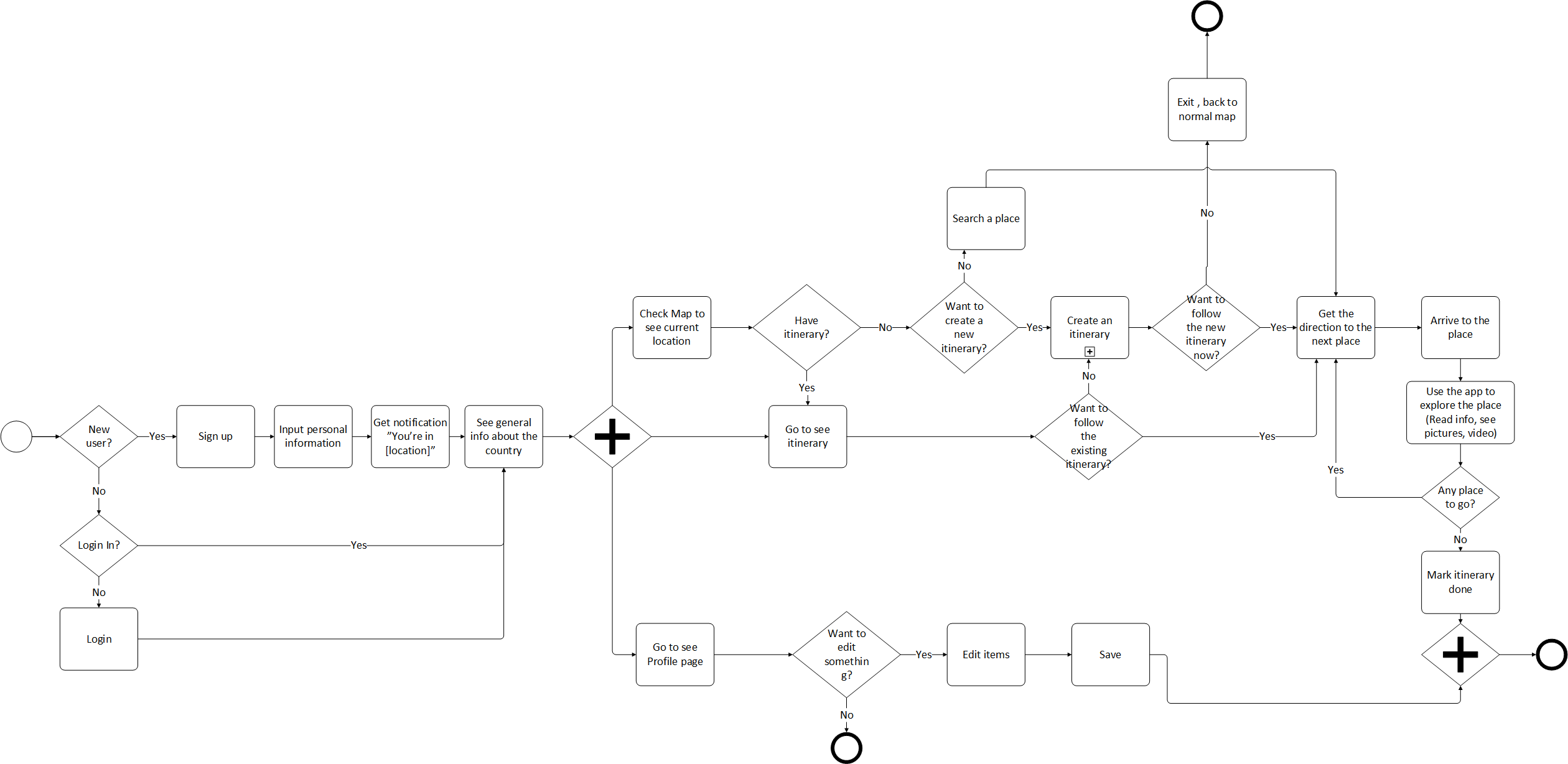
User flow visualizes the complete path that users follow across the whole application.
Part 2: Low-fidelity Version
Part 3: Concept Test
The lo-fi prototype was made in order to test the design concept.The test users were required to complete 5 tasks with the prototype and answer 4 open questions.
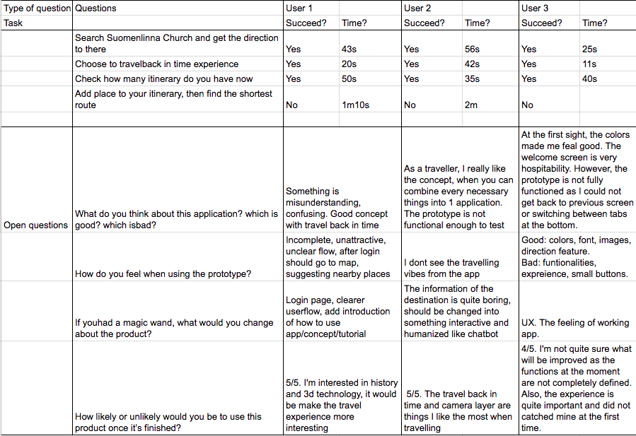
Key findings:
- The concept is interesting when it has travel back-in-time function and combines necessary things in one application.
- The app is not easy to use. It should provide some instruction/tutorial.
- The information of the destination is quite boring, should be changed into something interactive and humanized.
Part 4: High fidelity prototype
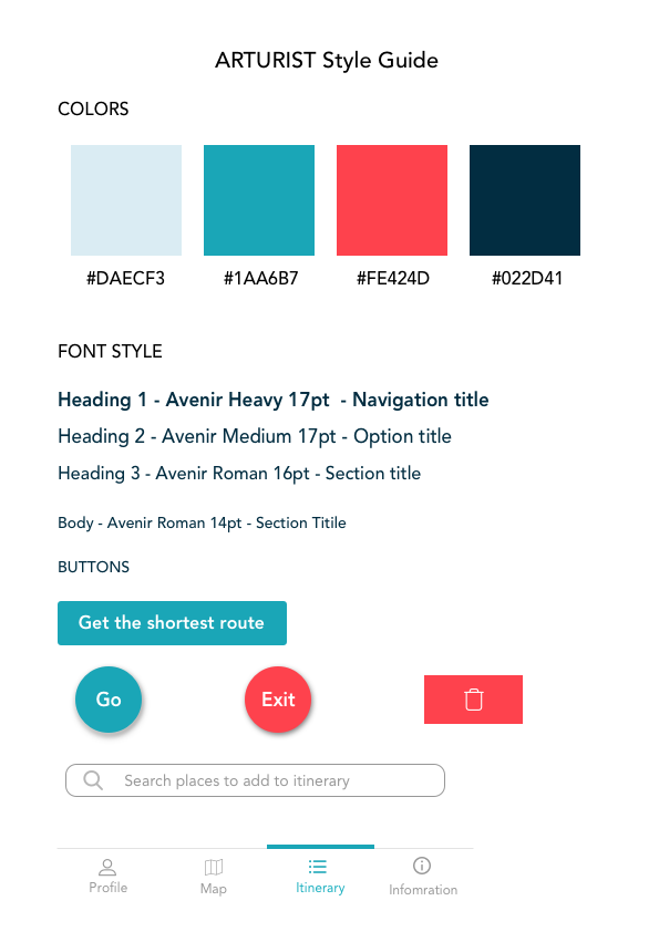
Based on the feedback from the lo-fi prototype, we made some adjustments to improve its usability then defined colors and font style for the hi-fi prototype.
Colors
The main color of the app is turquoise which stands for a friendly and happy color enjoying life. This color makes user feel calm, comfortable and balance when using the app. In contrast, the red color is used for warning situations such as delete, cancel or exit.
Font style
The chosen font style is Avenir – a san-serif typeface. Avenir has a harmonious and sensible appearance for both texts and headlines.
A hi-fi prototype with 40 screens was delivered. Link to hi-fi prototype: Invision link, Video link
Testing
After analyzing the most basic use cases of Arturist App, we’ve decided that a classic usability test is needed to provide more information about the actual usability of the interface. We have decided to test the product with a group of 6 participants, usually between 20 and 35, some of whom are participated in the research phase. A group of this size is a sufficient sample size to inform us about the performance of the interface. User interaction with the interface was recorded and analyzed by the team of researchers, which informed our recommendations for improving the overall product usability.
Part 1: Testing plan
Key Hypotheses
After initial analysis of the interface of Arturist App we came up with three hypotheses that we wanted to test during further research:
Users will have problems with navigating through the app’s UI
Users won’t be able to recognize the AR features (in direction, building scan and filter for taking photos) without assistance
User are quite familiar with popular apps’ features such as google map, chatbot
Objectives & Goals
- To determine design inconsistencies and usability problem areas within the user interface and content areas. Potential sources of error may include navigation, presentation errors and control usage problems.
- Exercise the application under controlled test conditions with representative users. Data will be used to access whether usability goals regarding an effective, efficient, and well-received user interface have been achieved.
- Figure out what people think and evaluate the AR function
- Establish baseline user performance and user-satisfaction levels of the user interface for future usability evaluations via user feedback
Participants
We’ve recruited 6 potential users. The selection of users was random. The detail information of participants is presented below:
| Gender | Age | Type of traveller | Mobile operating system | Occupation field |
|---|---|---|---|---|
| Female | 26 | Travel with family/friends | iOs | Hospitality |
| Female | 23 | Travel with family/friends, Group tour | iOs, Android | Business, Marketing |
| Female | 25 | Travel with family/friends | iOs | Data Analysis |
| Female | 30 | Travel with family/friends | Android | Front-end Development |
| Male | 24 | Travel with family/friends | Android | Software Engineering |
| Male | 21 | Travel with family/friends | Android | E-commerce, Digital Marketing |
Methodology
- Each user is provided with a smart phone which has the high-fidelity prototype of the app.
- The participants' responsibilities will be to attempt to complete a set of representative task scenarios presented to them in as efficient and timely a manner as possible, and to provide feedback regarding the usability and acceptability of the user interface by speaking aloud what he/she thinks about while working on these tasks.
- In this study, the Single Ease Question (SEQ) is deployed after each task completion in order to ask users to evaluate how difficult the task is.
- The participants will be directed to provide honest opinions regarding the usability of the application, and to participate in post-session subjective questionnaires and debriefing.
- The tester observes how the users approach the app and how long it takes for them to finish each task. Besides, the tester also records users’ thoughts and feedbacks.
- Time planning: 20 minutes for each user.
The hi-fi prototype that we used to test users can be seen here:
- Link to prototype
- The video showcase
- AR feature developed using Unity and Vuforia
Scenario & Tasks
Imagine that you’re visiting the Suomenlinna Island and you need to use Arturist App to explore that destination. Please use the app prototype and start working on your goal, just as you usually do. Please share your thoughts with us aloud so we can understand your feelings in each particular moment.Tasks for user:
| Task Code | Task Description | Success Criteria |
|---|---|---|
| T1 | Log into the application | User is able to log in |
| T2 | Find the way to King's Gate | User is able to arrive at the King’s Gate |
| T3 | Find the history information of this place. Tell the facilitator what it is | User finds and tell the right info |
| T4 | Imagine you are at the King’s Gate in Suomenlinna Island, view this place in 1919 | User is able to use the AR function |
| T5 | Choose your favourite traditional clothes and take a photo | User is able to go to that layer and take photo |
| T6 | Go to your itinerary "Helsinki Day 1" | User is in Helsinki day 1 screen |
| T7 | Add Suomenlinna Church into Helsinki Day 1 itinerary, after adding, go back to see your itinerary | User is able to add new place into existing itinerary and back to see itinerary. |
| T8 | Delete the Suomenlinna church you have added. | User deletes items |
| T9 | Back to itinerary lists and create a new itinerary | User create a new itinerary |
| T10 | Go to edit your profile like this: Interests remove food and drinks | User deselects the “food and drink" |
Part 2: Testing result
The testing was evaluated based on 4 key metrics:
Average of the percentage of users who successfully complete the task
Calculated based on the success score and how users rate the difficulty of the task
Average of the percentage of users who complete the task without any errors
Calculated based on how users response to 10 template questions in System Usability Scale tool
And the result is:
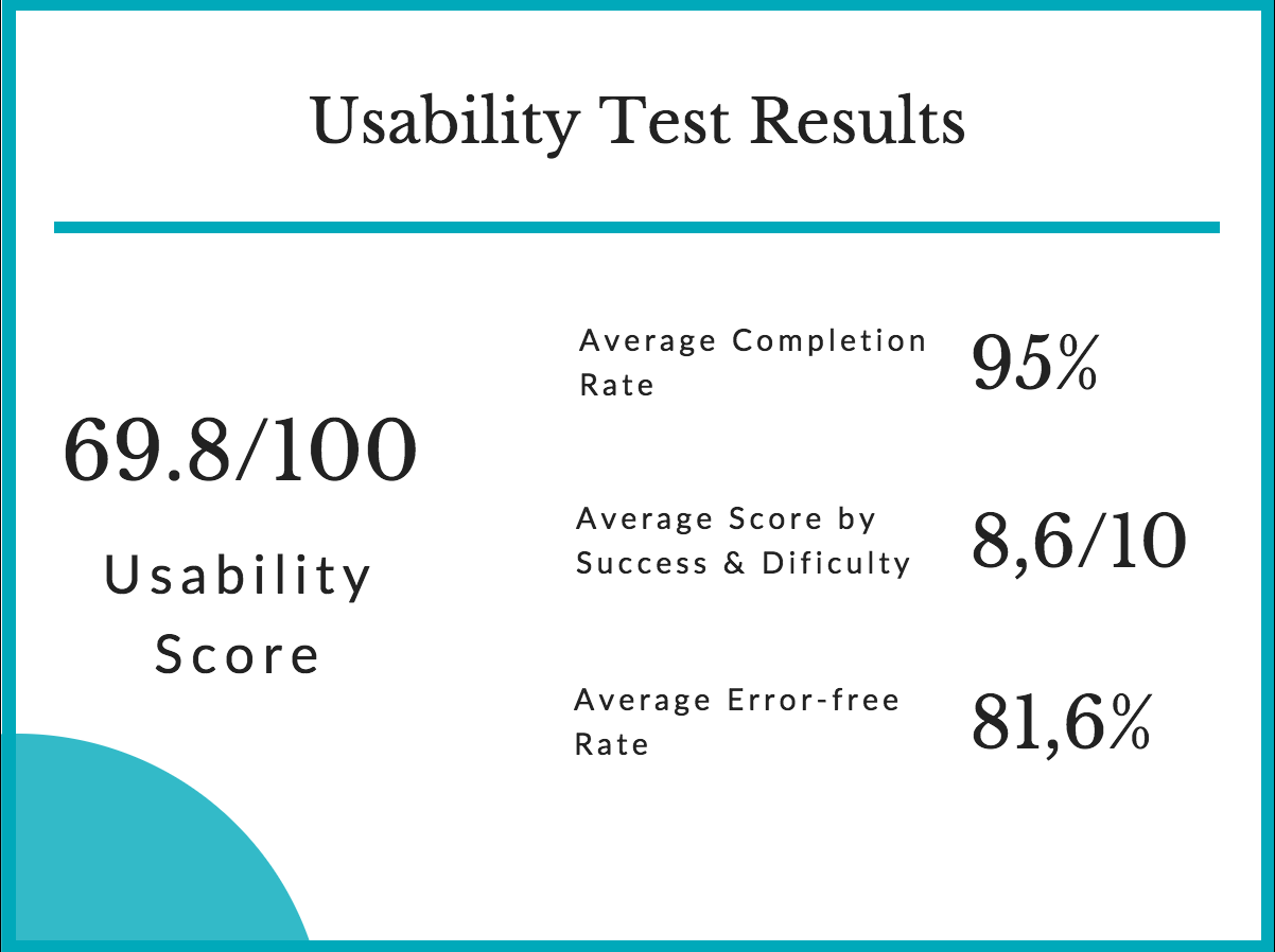
The average score is 69,75 which reflects the application is fine, but it needs to be improve in order to make people love and recommend it to their friends.
Users said:
It looks very professional and the functionality is well integrated into the app. I didn't feel overwhelmed by the options and each button had a clear purpose.
I think the AR looks cool, but still the features are quite simple and sometimes the logic is not easy to understand and follow.
It is usually quite straightforward but some buttons do not pop out the design so it is not too easy to see.
Key findings:
- People expect any map app to be like Google Map
- People are so excited about the AR features, but need time to get used to using them
- Simple labels work better than complicated words
- The visibility and intuition in UI design matter so much in a new product
Part 3: Recommendations
Improving points:
- Optimize the flow, try to reduce users' effort and difficulty
- Add on-boarding screens to educate people about AR features at the first time
- Redesign the layout and several invisible UI elements
- Redesign the information architecture, labels, wording
Future features:
- Reminder of the itinerary
- Local people and tourists give feedback about certain place
Conclusion
Most of the participants found Arturist application to be interesting, clean and uncluttered, useful and easy to approach. Users felt comfortable when doing standard tasks. However, the AR features were not well integrated with the prototype which made users be confused while performing several tasks. After the test, the designers identified the advantages as well as the disadvantage of the application.
For further development, the information architecture should be enhanced to give user a clearer and more perspicuous flow. Especially, implementing AR features need to investigate in order to deliver a real application. From business perspective, Arturist can collaborate with restaurants and cafes to show their info at the AR navigation as a way of advertisement.